
DBSCAN clustering on human brain cell data
- 10 minsHuman schizofrenic brain samples
Using density based clustering from sklearn I acquired some data that represents human brain cells and their diameter/length. Using these cells I calculated the cluster size distribution and visualized the clustered data for many distance cut-off parameters.
import pandas as pd
import numpy as np
from sklearn.cluster import DBSCAN
xlsx = pd.ExcelFile('S05_161ID12720CRcaudatecoordinatescleared4_60um.xlsx')
df1 = pd.read_excel(xlsx, 'Sheet1')
df1.columns = ['length', 'x', 'y']
The contents of the data file.
df1.head(n=5)
| length | x | y | |
|---|---|---|---|
| 0 | 4.1 | 25633 | 29230 |
| 1 | 4.1 | 31532 | 30709 |
| 2 | 4.1 | 32346 | 25639 |
| 3 | 4.3 | 8605 | 26359 |
| 4 | 4.3 | 24773 | 19835 |
import matplotlib.pyplot as plt
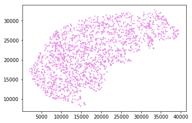
Visualizing the data points with applying length as marker size.
plt.scatter(df1['x'].values, df1['y'].values, s=df1['length'].values, marker='.', color=[.9, .6, .9, 1])
<matplotlib.collections.PathCollection at 0x7f4c78ddd710>
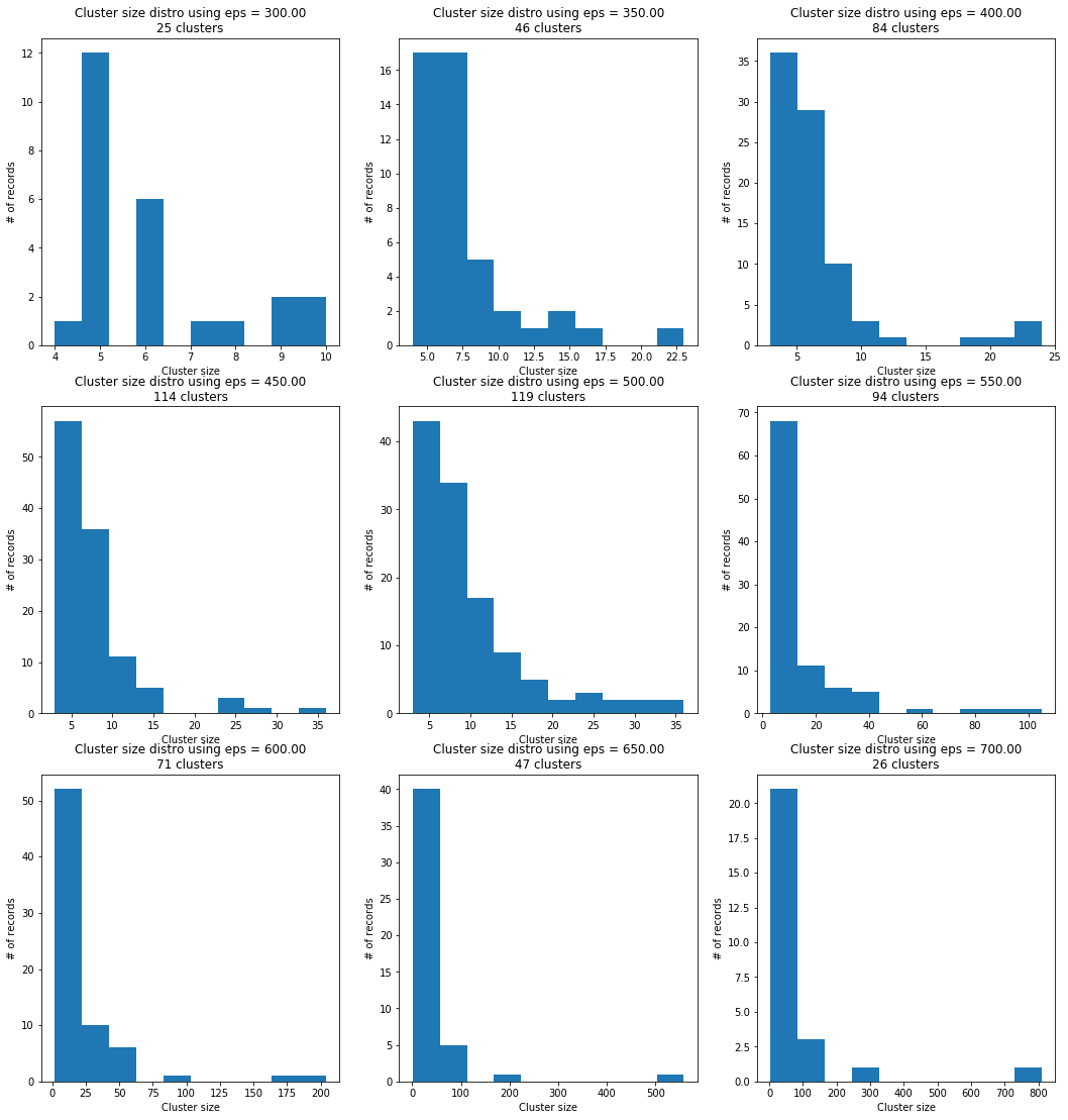
Showing the parameters of the outputted result by the classifier. Each data point (1862) is labeled by a cluster index and there are 476 core components which may or not in separate clusters for sure since there are 115 different labels only. Among these unique labels there is one that is labeled -1, the points this corresponds to are outliers, therefore not clustered, most of these points are left out from the histogram creation to not pollute the significant data.
clf = DBSCAN(eps=450, min_samples=5).fit(df1[['x','y']])
clf.labels_.shape, clf.components_.shape, clf.core_sample_indices_.shape, len(set(clf.labels_))
((1862,), (476, 2), (476,), 115)
Calculating the cluster size within a cut-off epsilon range.
def cluster_size(data, fromEps=300, toEps=700):
    plt.figure(figsize=(18,19))

    eps = np.linspace(fromEps, toEps, 9)

    for i, E in zip(range(1, 10), eps):

        plt.subplot(int(str("33%d") % i))

        clf = DBSCAN(eps=E, min_samples=5).fit(data)

        n_clusters_ = len(set(clf.labels_)) - (1 if -1 in clf.labels_ else 0)

        labeledData = dict()
        for label in set(clf.labels_):
            labeledData[label] = []
        for ind, label in enumerate(clf.labels_):
            labeledData[label].append(df1[['x', 'y']].values[ind, :])

        cluster_sizes = []
        for label in set(clf.labels_):
            cluster_sizes.append(len(labeledData[label]))

        cluster_sizes.pop(-1)
        plt.title('Cluster size distro using eps = %.2f\n%d clusters' % (E, n_clusters_))
        plt.ylabel("# of records")
        plt.xlabel("Cluster size")
        plt.hist(np.array(cluster_sizes))
    plt.show()
There is not enough data points to tell whether these are well behaving distributions but for example just by eye-balling the distro at eps = 500 it seems like log-normal.
cluster_size(df1[['x', 'y']])
Moving on with visualization I plotted them in a range that can be set by hand and clustered the points on x,y coordinated only, right after this part I am going to validate that using length as a clustering parameter is not significant.
def cluster_visualization(data, fromEps=350, toEps=750):

    plt.figure(figsize=(18,15))

    eps = np.linspace(fromEps, toEps, 9)

    for i, E in zip(range(1, 10), eps):

        plt.subplot(int(str("33%d") % i))

        clf = DBSCAN(eps=E, min_samples=5).fit(data[['x', 'y']])

        core_samples_mask = np.zeros_like(clf.labels_, dtype=bool)
        core_samples_mask[clf.core_sample_indices_] = True

        n_clusters_ = len(set(clf.labels_)) - (1 if -1 in clf.labels_ else 0)

        unique_labels = set(clf.labels_)
        colors = [plt.cm.Spectral(each)
              for each in np.linspace(0, 1, len(unique_labels))]

        for k, col in zip(unique_labels, colors):

            if k == -1:
                # Black used for noise.
                col = [0, 0, 0, .5]

            class_member_mask = (clf.labels_ == k)

            xy = data.values[class_member_mask & core_samples_mask]
            plt.scatter(xy[:, 1], xy[:, 2], marker='.', color=tuple(col), s=xy[:, 0])

            xy = data.values[class_member_mask & ~core_samples_mask]
            plt.scatter(xy[:, 1], xy[:, 2], marker='.', color=tuple(col), s=xy[:, 0])

        plt.title('Number of clusters = %d, using eps = : %.2f' % (n_clusters_, E))
        plt.xticks(np.linspace(5000, 35000, 5))

plt.show()
cluster_visualization(df1, fromEps=400, toEps=750)
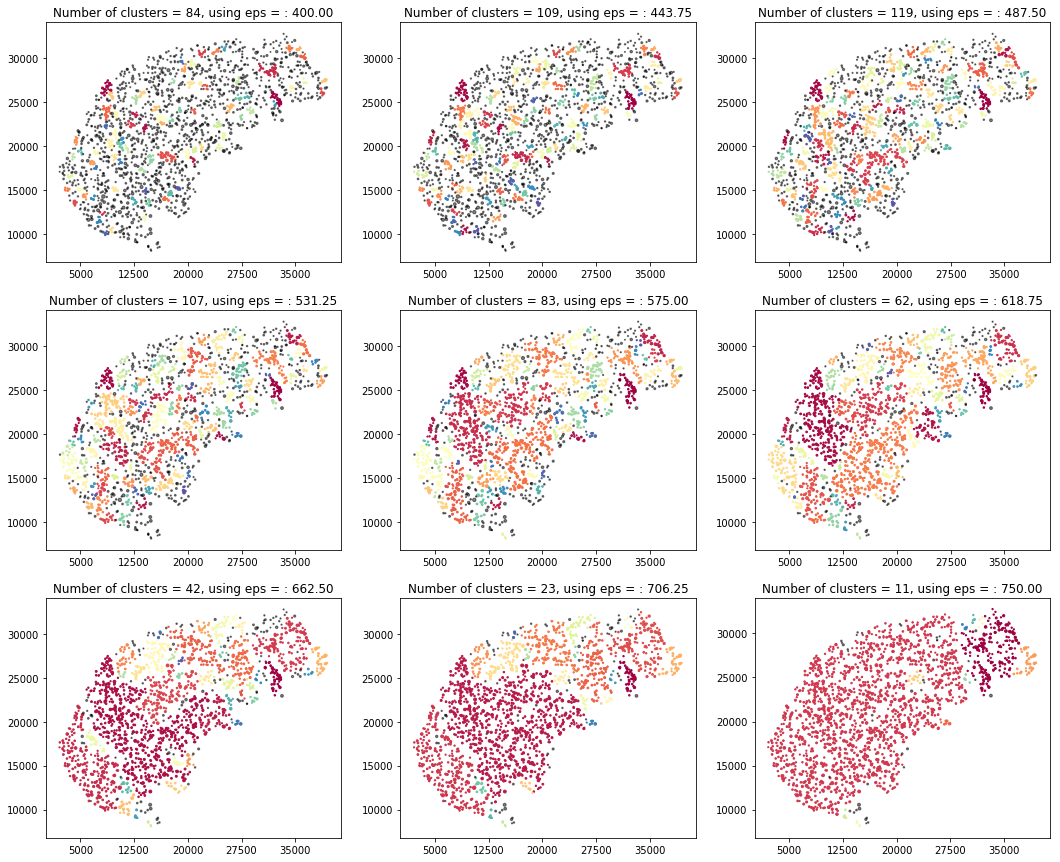
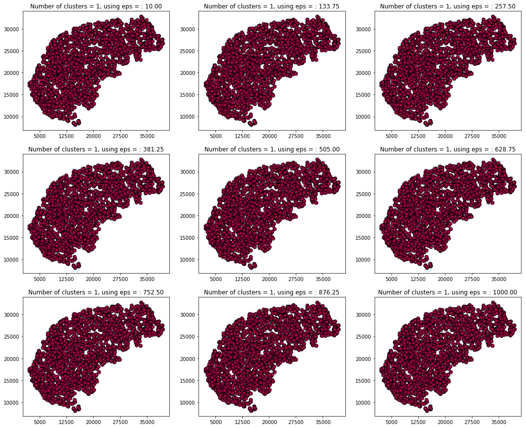
Using the length only for clustering clusters all the data to one giant blob and therefore does not seem to be significant.
def cluster_visualization(data_for_fit, data_for_viz, fromEps=350, toEps=750):

    plt.figure(figsize=(18,15))

    eps = np.linspace(fromEps, toEps, 9)

    for i, E in zip(range(1, 10), eps):

        plt.subplot(int(str("33%d") % i))

        clf = DBSCAN(eps=E, min_samples=5).fit(data_for_fit.values.reshape(-1, 1))

        core_samples_mask = np.zeros_like(clf.labels_, dtype=bool)
        core_samples_mask[clf.core_sample_indices_] = True

        n_clusters_ = len(set(clf.labels_)) - (1 if -1 in clf.labels_ else 0)

        unique_labels = set(clf.labels_)
        colors = [plt.cm.Spectral(each)
              for each in np.linspace(0, 1, len(unique_labels))]

        for k, col in zip(unique_labels, colors):

            if k == -1:
                # Black used for noise.
                col = [0, 0, 0, .5]

            class_member_mask = (clf.labels_ == k)

            xy = data_for_viz.values[class_member_mask & core_samples_mask]
            plt.plot(xy[:, 0], xy[:, 1], '.', markerfacecolor=tuple(col),
                     markeredgecolor='k', markersize=14)

            xy = data_for_viz.values[class_member_mask & ~core_samples_mask]
            plt.plot(xy[:, 0], xy[:, 1], '.', markerfacecolor=tuple(col),
                     markeredgecolor='k', markersize=6)

        plt.title('Number of clusters = %d, using eps = : %.2f' % (n_clusters_, E))
        plt.xticks(np.linspace(5000, 35000, 5))

plt.show()
cluster_visualization(df1['length'], df1[['x','y']], fromEps=10, toEps=1000)
@Regards, Alex

Alex Olar
Christian, foodie, physicist, tech enthusiast