
Twitter data - an interactive visualization and location prediction
- 8 minsAbstract
During the years the university has built a database using Twitter’s public API and collected more than 3 TB of data to analyze. I got access to this dataset and attempted to predict the location of users based on their followers’ location.
The problem itself is not a machine learning problem but an analytical approach and making assumptions about the behavior of users. Therefore I put an emphasis on visualization since the most crucial thing one does before any algorithmic solution is to analyze the visualized dataset.
The dataset
I was provided with an undirected, full graph with bidirectional data of followers. Meaning that the dataset I was given included all the users and their followers who they followed as well.
Localization
Using the locations of the user’s followers I wanted to select the largest group of closest followers and get the mean of their locations. The problem and the solution is well described but the implementation is not that straightforward since the locations are provided as geographical coordinates, so not only is clustering not trivial on the surface of the globe but also it is somewhat complicated to get the mean location of the users.
Since the number of clusters could not be estimated beforehand and I wanted to select the most densely populated neighbor cluster I used DBSCAN clustering which is density based and can relatively well cluster this type of data. It was also a huge advantage that the sklearn package included the Haversine metric.
The Haversince formula determines the great-circle distance between two points on a sphere given their longitudes and latitudes:
Where the angle - longitude or latitude - of a point. The central angle is defined as the fraction of the distance of the points over the radius R of the sphere which is 6371 km this case. The Haversine formula is described then as:

The distance can be derived from this formula. DBSCAN takes a few more arguments such as minimal distance to cluster on which was set to 5./6371. ( ~ 5 km ) and the minimum samples in a cluster was set to 5. The longitudes and latitudes were converted to radians and the clustering was done.
%pylab inline
import pandas as pd
Populating the interactive namespace from numpy and matplotlib
data = pd.read_csv('both.csv')
data = pd.DataFrame(data.values[:, 1:5], columns=['lon', 'lat', 'plon', 'plat'])
data.head(n=10)
| lon | lat | plon | plat | |
|---|---|---|---|---|
| 0 | -73.974228 | 40.740402 | -73.956551 | 40.733932 |
| 1 | -0.109380 | 51.514629 | -1.617727 | 53.785324 |
| 2 | 11.965316 | 57.701391 | 11.970102 | 57.703602 |
| 3 | -3.177368 | 51.484031 | -3.419140 | 51.706676 |
| 4 | -122.332845 | 47.624431 | -122.678070 | 48.506680 |
| 5 | 29.014727 | 41.040287 | 29.053541 | 40.979324 |
| 6 | -3.698262 | 40.432953 | -0.349279 | 39.458981 |
| 7 | -122.415811 | 37.778129 | -122.405975 | 37.783192 |
| 8 | -73.984697 | 40.734274 | -73.954956 | 40.784729 |
| 9 | -83.747251 | 42.305744 | -83.760040 | 42.410336 |
from astropy.coordinates import spherical_to_cartesian

def transform2cart(lon, lat):
    x, y, z = spherical_to_cartesian(6371, np.radians(lat), np.radians(lon))
    return np.array([x, y, z])
dists = []

for row in data.values:
    lon, lat, plon, plat = row
    dist = np.linalg.norm(transform2cart(lon, lat) - transform2cart(plon, plat))
    dists.append(dist)
The algorithm generates outliers as well and sometimes there are no clusters at all. In all those cases I just converted the geographical coordinates to cartesian coordinates, averaged them and converted back to geolocations. For proper conversion I used the astropy package which provided an implementation of conversion.
On the other hand, when the clustering was done properly I selected the largest cluster of the followers of a user and averaged their locations as the above described manner.
data = data.join(pd.DataFrame({'dist' : dists}))
data.head(n=10)
| lon | lat | plon | plat | dist | |
|---|---|---|---|---|---|
| 0 | -73.974228 | 40.740402 | -73.956551 | 40.733932 | 1.654017 |
| 1 | -0.109380 | 51.514629 | -1.617727 | 53.785324 | 272.185273 |
| 2 | 11.965316 | 57.701391 | 11.970102 | 57.703602 | 0.375902 |
| 3 | -3.177368 | 51.484031 | -3.419140 | 51.706676 | 29.863287 |
| 4 | -122.332845 | 47.624431 | -122.678070 | 48.506680 | 101.398925 |
| 5 | 29.014727 | 41.040287 | 29.053541 | 40.979324 | 7.520451 |
| 6 | -3.698262 | 40.432953 | -0.349279 | 39.458981 | 305.289563 |
| 7 | -122.415811 | 37.778129 | -122.405975 | 37.783192 | 1.031550 |
| 8 | -73.984697 | 40.734274 | -73.954956 | 40.784729 | 6.144119 |
| 9 | -83.747251 | 42.305744 | -83.760040 | 42.410336 | 11.677400 |
data.values.shape
(7927, 5)
accuracy = []
max_dist = 100 # km

for distance in np.linspace(1, max_dist, max_dist // 2):
    filtered_data = data.loc[data['dist'] < distance]
    accuracy.append(filtered_data.shape[0]/data.shape[0] * 100.)
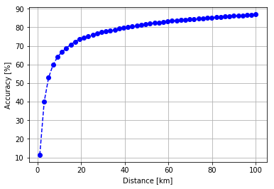
Accuracy
Finally I created a dataset with the predicted and actual locations of the users and generated 50 filtered dataset based on maximum distance between the predicted and actual locations. With this method I acquired some kind of accuracy metric:
plt.plot(np.linspace(1, max_dist, max_dist // 2), accuracy, 'bo--')
plt.grid(True)
plt.xlabel("Distance [km]")
plt.ylabel("Accuracy [%]")
plt.savefig("accuracy-distance.png", dpi=100)
plt.show()
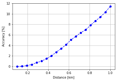
accuracy = []
max_dist = 1 # km

for distance in np.linspace(0.01, max_dist, max_dist * 20):
    filtered_data = data.loc[data['dist'] < distance]
    accuracy.append(filtered_data.shape[0]/data.shape[0] * 100.)

plt.plot(np.linspace(0.1, max_dist, max_dist * 20), accuracy, 'bo--')
plt.grid(True)
plt.xlabel("Distance [km]")
plt.ylabel("Accuracy [%]")
plt.savefig("accuracy-distance.png", dpi=100)
plt.show()
Considerations
There is no point in raising the maximum distance more therefore I am not calculating the accuracy in that case. The accuracy was simply acquired by taking the maximum number of predicted points and dividing by it on the filtered points. Unfortunately the distance calculation in this period was not based on the Haversine metric but on basic cartesian distance, although, it is not completely inaccurate in this 0 - 100 km scale.
Most probably the prediction accuracy would be much better in a city densely populated by tweets such as London or New York.
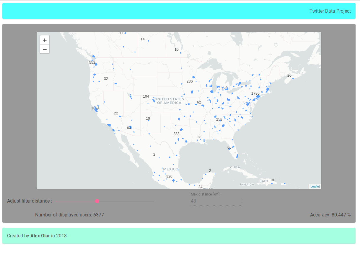
Visualization
With some static data files, I build an Angular 6 application and deployed it on Heroku. I used Leaflet.js’ Angular implementation by Assymetrix to visualize the location of users and their predicted locations. The max distance can be set with a slider but the loading time is pretty bad on maximum distance change.
Click the image below to be redirected to the application. Heroku loads very slow on the first time so be patient.
@Regards, Alex

Alex Olar
Christian, foodie, physicist, tech enthusiast